So this is an update on the stuff I did for my latest project over the Christmas break as I didn't have much time to blog during this time.
After talking with one of my lecturers what I decided to do for my final piece was to make a set of swatch cards that are found when choosing colours from DIY Stores. These cards would depict my emotions over the course of 15 days through the colour of the card, and also feature a photograph of me with the colour projected onto my face.
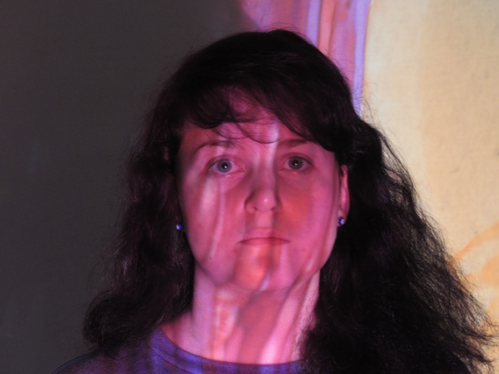
Photography Test 1
How I was going to project the colours onto my face was through using coloured pieces of acetate and an over head projector that was in the shed.
This projected the colour well enough onto my face however I would need to make the blocks of colour bigger as in these photographs you can see the adjacent colour in the background.
However what I discovered that was that the lines that the marker left on the sheet of acetate gave the photographs more texture and interest, rather than it just be one full plain block of colour.
Photography Test 2
These photographs were done using the same process except this time I made the blocks of colour bigger so they took up more space when projected and I also deliberately made the lines of the marker more visible so that there was more texture in them.
I also decided to wear a white t-shirt in the photos so that the colour would be reflected better below my neck.
I also tried adding some imagery to the photographs as one of the points I was making in this prject is that it is these emotions that make us who we are, and it makes us human.
One of the things I tried was adding another layer of acetate on the projection screen with images drawn in black. These were sort of obscured but I still think they had a nice effect.
These ones were done by removing some of the pen ink using hand sanitiser and cotton buds to draw the designs.
I really like the effect these gave as even though you might not necessarily be able to tell what they are, especially if I cropped the photo to fit on a card, the point and the design is still there, and there is more depth to the photo.
Making prototypes
So my dad's shed is almost like a cave of wonders where you can can a lot of random and sometimes helpful stuff in there, an example of this is a small glass tank. My idea was to fill this tank with a bit of water and then splash ink in it to create almost the same effect as the acetate, but with a bit more movement.
I think this process worked extremely well as the effect was better than I could have imagined as it also gave the impression of mood more than the acetate did.
Making these prototypes also helped me to iron out any mistakes that I could make in the final steps for instance, I knew what inks would take more and look more intense.
Making the photos in this process also allowed me to colour the card as well to make the colour swatches, which I think adds to the process as it creates a gradient emotion and the exact colours in the photos were used in the card. The more colour I used in the projection, the stronger that emotion and therefore the more colour that would be on the card.
Final photos
So here are a few of the photos that I took to put on the cards.
Although some of them were a bit blurry purely because of how they had to be taken, I still think that they turned out really well, and were what I was hoping them to be.
Card Examples
So my original plan was to take the photographs and then have the printed onto card almost like they would if they were real colour swatches from real store, however I decided to go along with the ink idea as I felt that this added more to the project.
I image transferred the photos onto the card that i dyed after I took the photo with the in I used. I do like how these turned out as they are slightly fragile looking and imperfect which I feel also adds to it as they are meant to be a representation of me and to bring home the fact that I am huan and it is these things tat make me human.
So any way that's all I have for you just now. I am planning on doing a lot more Inspiration of the week posts to help me research for my upcoming brief which I have still to write D: so you can look forward to many of those with some updates on my work scattered in between :P
Until then
byyyyyyyeeeeeeeeeeee
Róisín -x